Upgrading the GFX Generators to the new engines wasn’t easy and I’m surprised that it went that well. Still, fixes to the new GFX Generator engine:

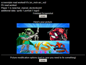
1.) I made some fixes & improvements in September and thought I’d uploaded them then, but I somehow didn’t. The links on the outside frame let you skip around to different menu sections, but the “DONE” button link on the second menu page was busted until now.

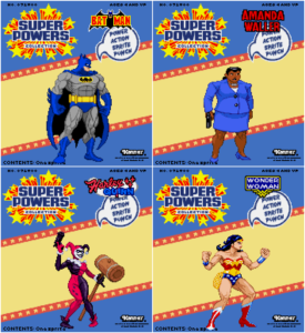
2.) The redone version of the “Super Powers 176×192“ wasn’t displaying the mini-logos and I missed that when converting it to the new data format. That’s fixed now, too.

gfxgen_2016-11-01_superpowersfixed

Work on the rewritten GFX Generators is going along nicely. I had to pause working on it while I drew a commission, but I’m back on the case. I’d made a few posts on Tumblr (here, here and here), but kept forgetting to make a post about it on the site for people who read the blog or follow the RSS.

gfxgenv2_menuworking

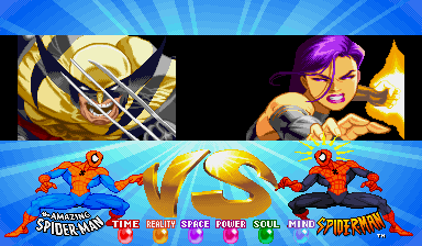
The current version of the engine can mimic the Marvel Super Heroes Vs. Screen, including the new portrait palettes feature. That screen wasn’t a random choice, because the original (and current) generator engine started life as only making fake MSH Vs. screens. That means I started by redoing some of the oldest (and most badly coded) parts of the old engine. The character data file format was changed, so the early work had me testing everything from a Spider-Man test character, so he’s the stand-in sprite for a lot of early test shots.

testpic_portraitpalettes_wolverine-psylocke

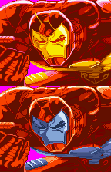
One unexpectedly big hurtle was updating the MSH portraits with palettes. Sorting 16 colors for sprites is easy, and characters with sprite overlay effects add a bit of challenge. These portraits MSH portraits can hit the 40 and 50 color range, including some colors that are virtually the same, but that’s not the worst part. You can’t immediately tell when certain characters have shading sections that appear and disappear depending on which palette it’s using. Most problems are little things, like a few pixels of Psylocke’s psi-blade sharing colors with her belt in the main palette, but not the P2 colors. I just mapped them to an extra color, no big deal. Then there’s Iron Man.

msh-arc_portraitdifferences-ironman_x3

gfxgen2_portraits_shumagiveup

Seriously, look at the lines above the faceplate and the edge lighting on the helmet. It looks like the shading changes for a few tiles (and viewing the tiles in WinKawaks while scrolling through palettes doesn’t seem to make it look like the P2 version). A few P2 portraits have separate versions because mapping is far too ridiculous for me to deal with. On the flip side, Blackheart only had 16 colors. 16 colors! Since many of the portraits I’ll be updating don’t have color maps as nice as Mephisto Jr’s, I can’t promise that I’ll be able to boil all of them down to one portrait.

While this new version has a long way to go before replacing the generators you see on the site, it will soon be finished enough for me to upload a generator that only does that MSH Vs. Screen. Don’t worry, you’ll have more than the 12 default characters in there. I’ll slowly add new screen and graphic generators as I convert more features and characters to the new engine format until it completely replaces the main generators you see on the site now. This will start VERY soon, so get ready for it!

I bought Anime Studio Debut 10 a little while ago and I’ve spent the past week messing around with short pixel art clips. I decided to throw a few of them together for an intro mock-up with some incomplete music from 2013 and a Blender-rendered animation I did years ago. The timing is janky in a lot of spots, but I was more interested in how it looks. I’ve got some weird ideas for 2015 and this is just a test.

I’ve uploaded an unfinished upgrade of the Vernacula-X Glossary section. Some of the definitions now link to their own pages with expanded definitions and all kinds of relevant links. The definition for boss links to the S-Files of characters who are bosses and the entry for beat-em-up displays a list of beat-em-up games that are in the Game Index. The biggest page so far is for the term palette mostly because it uses some graphics I’d made for an unfinished tutorial. Expect more solo pages, terms and improvements before the update on the 19th.

Don’t worry, I’m working on pixel art, too. One of the sprites you’ll see on the 19th can be seen in this post on the ScrollBoss Tumblr. Yes, it’s about time I made a Capcom-style standing sprite for him. You can leave Disqus comments in the Tumblr posts now so you don’t have to be on Tumblr to post replies there now.

Again, the update won’t be huge, but I think you’ll like it. Expect the new custom sprites to be a mix of fan-favorites and the lesser-loved characters that get respect here. They’re all purely game-related, non-licensed characters, too.

I’m working on a new feature for the generators that will be in the next site update (which isn’t now, BTW).

The original game font functions worked and the system was set up for multiple fonts, but it wasn’t flexible. Adding this forced me to clear out the clusterfudge I’d made of the old font system. It’s ridiculously plain right now as you only choose the font and palette through descriptions in a pulldown list with no previews of them. Still, it works and will hopefully make the font-using generators more fun.

Here’s a list of the fonts I have finished so far: Street Fighter Alpha 3 8×16 and 16×16 fonts, Streets of Rage 3’s 8×8 and 16×16 fonts, Final Fight’s 8×8 font, Pac-Mania’s 8×8 font (basically the classic Namco 8×8 font with lowercase letters and more characters), River City Ransom’s 8×8 font and Marvel vs. Capcom’s 32×32 font (seen above). Are there any other in-game fonts you’d like to see? Please leave a reply if there are and I’ll see if I can get it in there.

2011/09/21: Finally have a system set up for “SubStyles” for the screenstyles. This will replace some of the clunkier option choices on the second menu page and allow for more adaptability. Not only does it change the look of the screen but it can change the standing position of sprites and logos.

I now have all the old game box styles merged into one. I’ll have clickable thumbnail pics instead of full-sized number maps for the release version. The next step is to do something similar with the multiple backgrounds. It should be easy since the SubStyles architecture has all the basics to do whatever I need to do with to the main backgrounds.

2011/09/22: Multiple backgrounds issue solved. Dig it:


This solves a lot of the issues I’ve had with the multiple background options you can choose from in the styles. The version on the site now lets you pick background parts but you also had to choose the separate front part. This new thing modifies the style as much as it needs. One choice picks both the front, back and middle background layers, changes the shadow style, colors or transparency and can even change where the sprites stand. I can combine most of those “7 people standing somewhere” styles in the Group Maker into one choice and you’ll choose the background on menu 2. Tidy. This will also let me make styles that have **deep breath** a substyle that triggers a lot of options (Box homages) and then use the Scene modifyer to do things with the picture inside that box layout.

Bonus: I tested this out on that Vs. Screen where you could pick the different background parts. I eventually got sick of making thumbnails so a made a quick PHP routine that reads the Scenemod list and spits out a bunch of automatically-named numbermap images I can save.

It beats the hell out of making each pic one by one. I have a few more styles that will need a dozens of shots like this so I’m saving a lot of time with this. Why should you care? Because saving time on the crappy stuff gives me more free time to work on sprites, backgrounds and all that. Anyone who actually read all this deserves something so here’s a little spoiler to the big update in mid-Oct./early Nov.:

Yeah, KoF sprites will be added to the Generators along with more SNK characters.

2011/10/22: I made a new GroupShot style that creates 100 by 100 pixel avatar-style graphics. I modified that automatic preview screenshot maker so that it dumps all of the shots into a temporary folder and rebuilds the graphic list file to have the new screenshot’s name. An gigabuttload of time is saved by doing that instead of manually making over 60 new shots and adding them to a flat file for the system. The avatars will have quite a few different borders including some that are just a pixel wide. Here’s a preview pic with four of them:

I still need to mess around with something I added that tries to adjust for tall sprites that go off the screen but it works well so far.

ScrollBoss is still on pause so I could work on my own characters and comics for a bit while doing behind-the-scenes work on the site along with a bit of content. I need your help to shape some of the new content for the site. Some of these will come as close as I’ll get to doing a request thread.

1.) There will be new GFX Generators geared towards making avatars and sigs you can save and use on message boards and social sites. There will be the typical square shapes but I need to know what sizes or ratios you use in these places.

2.) There will be new sprite tutorials in the future. I’m not an expert but I think I’ve figured out enough to write decent tutorials on a few things. I’m going to finish a lighting tutorial that I started long ago along with tutorials based on questions people have PM’ed me with on a message board or two. Are there any pixel art questions you’d like me to try and answer in a future tutorial?
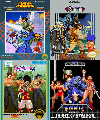
3.) I added these old-school game boxes to the GFX Generators a while back but I’ve never really gotten any feedback on them. Did anyone like them? Do you want me to make more? I will add the top 3 requests if any are made. Yeah, that’s a big if.

4.) Are there any game logos you’d like to see converted into 64×26 pixel mini-logos that aren’t already on this mini-logos page? Don’t be too ashamed to ask for something related to your current fan-game project. I’ll make either the 5 most requested or my 5 favorites.

5.) I want to start a yearly event where other fans like you get to vote on some of your favorite gaming things. The easiest way to do this is to post a category here and have you leave a comment with your choices. Yes, this topic is also a test to see how that would go. I need to know if it’s too much trouble to leave a comment in these news posts and if you’d be willing to post here again when it’s time to vote.

Please post your answers in a comment on this weblog post so I’ll have an easier time counting up the votes. I’ll do more Request Line posts if I get enough responses to this one.

**edit**
One more thing! [/unclebill]
6.) Go to the Vs. Maker, click the “Custom Scene (384×224 pixels)” option, hit button DONE! button and look at the background image options. Are there any game backgrounds that you’d really like to see added to that list? I’ll add as many as I can.

(edit: fixed the Vs. Maker link right above this. Thanks for the heads-up, Kiwi!)

EDIT: This Request Line is now semi-closed. That means that I can’t aim to have any new requests make it into the late October update. Any requests after this will be considered for future updates.

The Game Index is getting a few improvements and I can do most of them in undercover mode until the ScrollBoss is unpaused. You’ll be able to see lists of games based on something about them. For instance:

Look at all games that start with the letter A.
Look at all games from 1989, the greatest year in video game history.

Yeah, I know, like any other actual video game site. But still. The main index page will let you search by categories once the big update hits. It won’t just be a giant list dump, a lazy placeholder I was using until I got something like this together.

I’ll throw a few new 200×100 graphics in just to keep it interesting.


Started messing around with an idea at around 3 AM. Just finished working on this and some other engine improvements at 8:29 AM.


So far, so good. Time to go to sleep.

Update 2011/08/03, midnight:


Worked on it before and after work. I had to change big chunks of how the engine worked just for the name thing to work.

Update 2011/08/04, 3:28 AM:
Tried to unwind for a bit, answer messages, etc. but I wanted to get a bit more done on this tonight.


Still having a bit of trouble with a text mode that I won’t have to use for a while but the centered alignment version works. I still want to fix it before I go to sleep and I’m sure I’ll be paying for that tomorrow.

Update: 10 minutes later:
Got that optional text issue fixed. So much for that.

(more…)

I need some help with something. The next ScrollBoss update will (hopefully) have at least one “mini logo” for each letter of the alphabet. Here is the current state of which letters I have done so far:

A B C D E F G H I J K L M N O P Q R S T U V W X Y Z

I need suggestions for the letters that haven’t been crossed out yet. They have to be logos for old (16-bit or older) action/adventure games or the names of major characters in those games. Action-adventure means no sports games, no FPS and no faceless-entity-in-a-vehicle shooters (shooters like Contra & Rolling Thunder are allowed). Sprite-based fighting games and characters ARE allowed. Check this page to see if I haven’t made it already:
Mini Logos page

I know there are some obvious ideas for open letters (especially E) but I’d still like to see if anyone says anything. Leave your ideas in a comment to this post and I’ll add them to the list. I can’t guarantee that I’ll get them all made but I’ll have add them to the to-do list. Well, I will unless they’re really bad. Also: anyone who posts at least one good request will be added to the “Special Thanks” area of the ScrollBoss credits page. Be sure to let me know what name you want me to credit you by and if you have a website you’d like for me to link to in the news post once the update hits. This will be updated as I finish more logos.

Update 1: Just got O and Y finished. Their names in the U.S. versions are M and L so I’ll be lazy and save those for another update.

Update 2: T is done, too.

Update 3: E is done with a drone enemy who is in the GFX Generators and needed a logo.

Update 4: U minilogo is finished. Somehow managed to hint at the crazy bevel and shading in the big letters.

Update 5: K minilogo done. The IREM section looks a bit better thanks to the last two I’ve done Thurs. night/Fri. morning.

Update 6: J (Final Fight’s J), R and V minilogo done Fri. afternoon. Three more to go!

Update 7: Thanks to a post I made on Twitter, I have suggestions for P and W. Buyog mentioned Pengo, one of the options I had for P so I rolled with it.

Update 8: Okay, it’s all done now. Time to finish coding the last new additions to the minilogo page then add the appropriate logos to the Gfx Generators. Thanks for playing!